Professional Headshot Background Guide: How to Pick the Right One
August 27, 2026
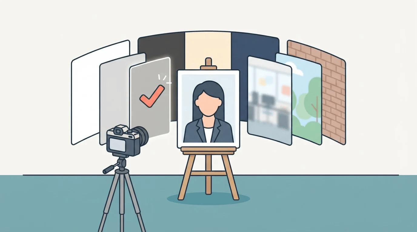
Here's a fact that trips people up: your headshot background gets noticed before your face does. Not consciously, maybe, but the eye reads the scene first, the person second. A cluttered desk behind you says something different than a clean charcoal backdrop, even if your expression and outfit are identical in both photos.
So the background isn't just a color choice. It's part of the message.
What your background is telling people
Think about the last time you scrolled through a company's "About" page or a recruiter's LinkedIn search results. Solid, neutral backgrounds read as polished and consistent, the visual equivalent of a firm handshake. Softly blurred office or outdoor scenes read as approachable, a little more "real person, real workplace." Anything busy, dim, or obviously a bedroom wall reads as unprepared, whether or not that's fair.
None of these is objectively "better." They're just different signals, and the right one depends on where the photo is going.
The two main categories
Solid, neutral backgrounds (think white, light gray, charcoal, cream, navy) are the safest default. They put all the attention on your face and expression, they don't compete with your outfit, and they hold up in nearly any context: corporate directories, LinkedIn, conference bios, press pages. If you only get one headshot style, this is it.
Scene-based backgrounds (a softly blurred office, a dusk city street, an outdoor setting, exposed brick, a bookshelf) add a bit of context and personality. They work well for personal branding, creative fields, speaker pages, or anywhere you want to feel a little less "corporate stock photo" and a little more like an actual working professional in an actual working environment.
Neither category is more "professional" than the other anymore. A well-lit blurred office background reads just as credible as a plain gray one; it just tells a slightly different story.
Matching the background to the purpose
- LinkedIn or a corporate team page: A neutral solid color or a softly blurred office is the classic corporate headshot background choice, keeping you consistent with colleagues and not pulling focus.
- Personal brand, portfolio, or speaker bio: A scene background (bookshelf, brick, outdoor) can add warmth and make you memorable, as long as it stays subtle enough not to compete with your face.
- Acting or casting headshots: Stick to simple, neutral backgrounds. Casting directors are evaluating your face, not your set design, and unusual backgrounds are genuinely a distraction here.
- Passport, visa, and other official ID photos: Skip the choice altogether. These have strict, government-mandated background rules (plain white in most countries), there's no creative room to work with, and getting it wrong just gets your application rejected.
Mistakes that undercut an otherwise good photo
A few things quietly wreck an otherwise solid headshot:
- Busy or patterned backgrounds. Bookshelves crammed with color, a window with visible blinds, a wall full of art. All of it pulls the eye away from your face.
- Colors that clash with your outfit. A navy background behind a navy blazer flattens the whole image. Aim for contrast, not matching.
- Uneven lighting or harsh shadows on the backdrop. This is the single most common giveaway of an amateur setup, even more than the background choice itself.
- Backgrounds that scream "trend." Heavily stylized virtual backgrounds date fast. A photo with an obviously trendy virtual background is worse than a boring one that still looks current.
How Portraify handles it
This is exactly the decision we built into Portraify. Upload a few casual photos and choose one of ten background options, ranging from clean solids (Classic White, Slate Gray, Charcoal, Warm Cream, Navy) to scene-based looks (Office, Outdoor, City Dusk, Brick Wall, Library), to generate a full set of headshots with that background. Since it takes minutes rather than a studio afternoon, you can generate another set and compare a neutral gray version against a blurred-office version side by side before deciding which one fits your LinkedIn profile or team page.
For the Passport, 1-inch ID, and 2-inch ID formats, Portraify skips the decision for you and locks the background to plain white automatically. That said, official requirements vary by country and purpose, and some agencies don't accept AI-generated or retouched photos, so confirm your own requirements before you submit.
The takeaway
If you're not sure, start with a neutral solid background. It's the safest, most versatile option and it's hard to get wrong. Reach for a scene-based background when you have a specific context to lean into, like personal branding or a speaker page, and want the photo to feel a little more like you.
You can try Portraify here and generate your own photo across every background option to see which one fits best!